Dream Kitchen Renovation: The Source Guide
First, a Bit of Background
My husband Jason and I bought our home in early 2019, back when our Joe was only two months old and after we had only lived in our first home for two years. We were quickly realizing how little time we had left before we’d outgrow that first home (baby’s need a lot of stuff, and it seems like most of it is big and clunky!). If you were to scroll wayyy back to pre-2019 on my Instagram account @nest.out.west, you’d see what that home looked like, all of our projects, and how some elements of our style have either changed or remained the same. I do miss that home (Jason does, too), mostly because we worked on it for two years and made it EXACTLY what we wanted, and then Joe was born. That home had a teeny-tiny two-car garage, no basement, no crawl space, and one little storage closet under the stairs. It was a great starter home, and all of the work we put into it helped us sell it for a major profit and afford us the opportunity to move into our current home.
Our home now was straight out of 1999 when we closed on it. It’s funny, but when we walked in for the first time to see it in person, I was in love! Jason didn’t get it.
There was wall-to-wall 20-year-old beige carpet, matted and worn (although you could tell the previous owners took care of it, there’s only so much you can do to keep 20-year-old carpet looking new). The only places that didn’t have it were the foyer, the bathrooms, the formal dining room, and the kitchen (from the front of the island back to the cabinets). Those spaces had either builder-grade tile, vinyl, or skinny-plank yellowy-orange hardwoods.
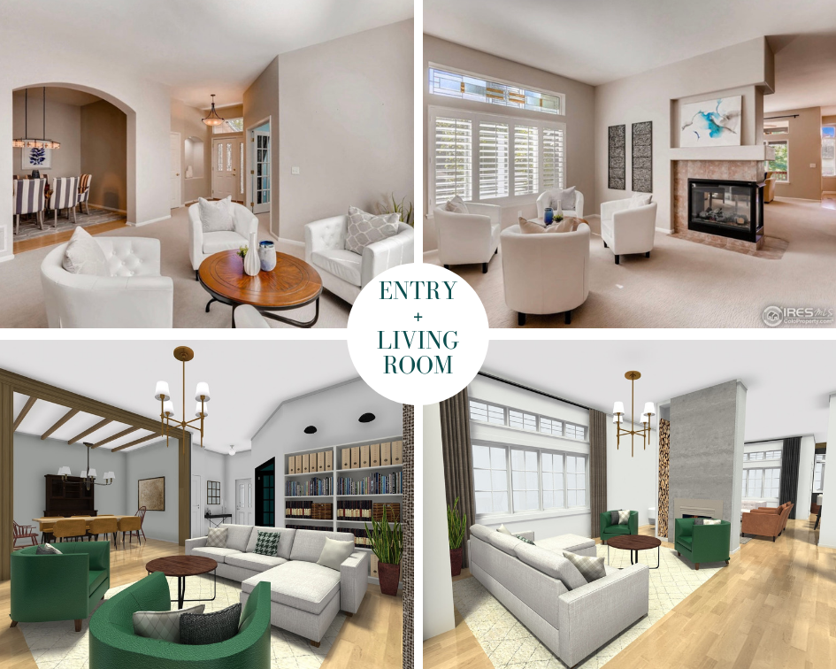
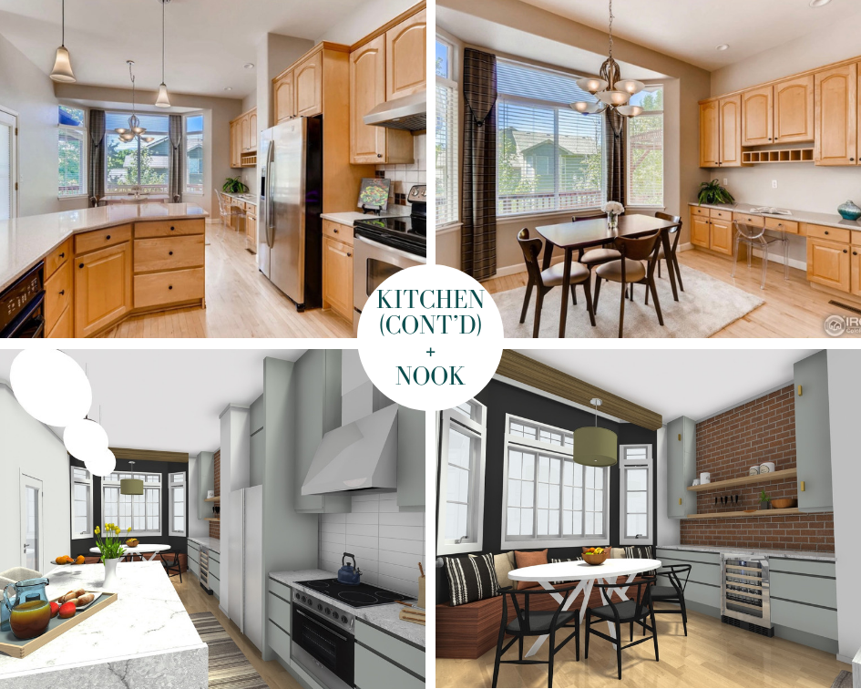
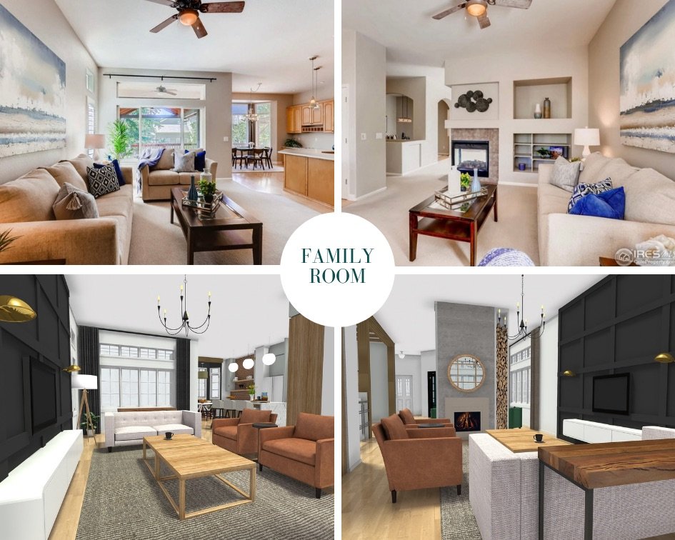
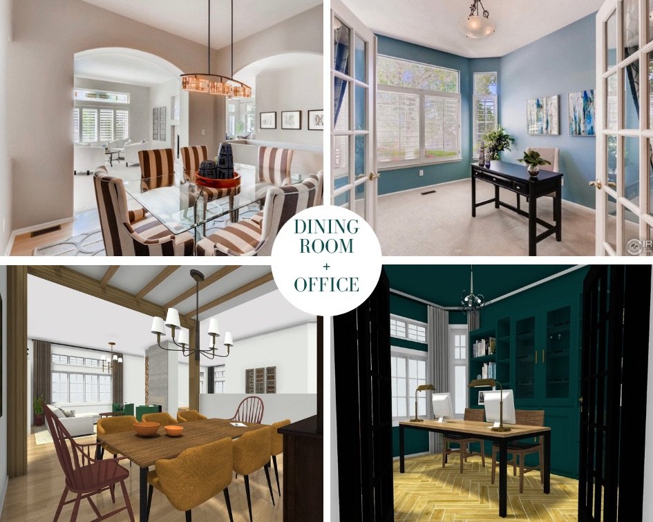
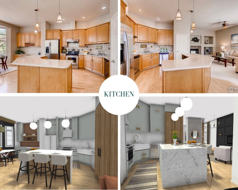
Upon stepping into the home and taking it all in, I could immediately see what this home could become. Jason needed a bit of—check that, A LOT of—convincing. So I wrote down all the measurements of the new home (yes, I always have my tape measure with me), found a free rendering program online, and recreated all of the main spaces in this home with updates to show Jason what they could look like with a bit of work. Want to see them?
These are some of the renderings I made before we decided to buy the house:
First Fix: The Kitchen
Did you know that prior to this big remodel I’m sharing with you now, we actually did a budget glow-up in our kitchen?
It was for the Spring 2019 One Room Challenge, and it was mostly just paint and peel-and-stick vinyl, but it made quite an impact!
We purposely didn’t want to spend too much money on this quick-fix, as we knew that our dream kitchen was more important, and we needed to save up all we could for that in order to make it happen sooner rather than later. After all, the original kitchen’s drawers were coming off the tracks when we’d open some of them, some of the doors didn’t align properly, and the entire island’s countertop was made of a marble-look peel-and-stick vinyl, so it wasn’t the best place for food prep. (No cutting on it, no heat on it, there were seams that separated a little bit each time we washed the counters, etc.) It held up as long as we needed it to while we saved and prepped for the bigger renovation, though!
The Real-Deal Renovation
It should go without saying that we wouldn’t have been able to tackle this when we did had it not been for our incredible, generous (and incredibly generous!) sponsors. I’m excited to share a little bit about how each of these brands helped us achieve my vision for what our kitchen could be (and what it is now!).
The Cabinets
We demoed our entire kitchen on April 1, 2021. With one toddler who was a little over two at the time, and baby number two due in June, we wanted to make this DIY installation as cost-effective and time-efficient as possible while not sacrificing style. I looked at a few options for pre-assembled cabinets that would ship straight to our home, but only one of the options I looked at carried flush inset cabinets (my obsession for the two years leading up to this!). We chose to go with that cabinet supplier, CliqStudios.
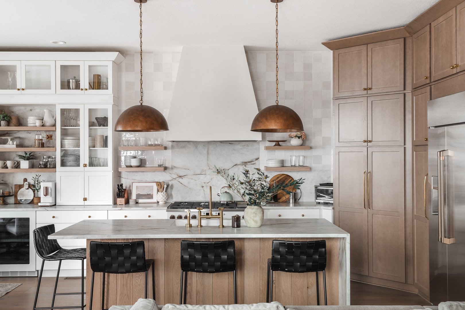
No, I didn’t end up going with flush-inset cabinets because when all was said and done and we had modeled the kitchen in the CliqStudios design program, they were just a bit out of our budget. My next closest kitchen style obsession was the warm, two-toned, creamy white and warm wood look. CliqStudios carries an on-trend variety of paint colors and stained wood cabinets that come standard in their Signature Plus collection, and the Newport style was the most aligned with my taste. I love that it has a narrower frame on the door and drawer fronts, yet still has that traditional shaker style. The finishes we chose are Fossil for the wood toned cabinets and Lily for the creamy bright white. Many people have asked already what the paint color on the white cabinets is, and I’d say the closest color-match is Benjamin Moore Swiss Coffee.
Additionally, all of the Signature Plus styles come standard with soft-close doors and hardwood dovetailed drawers, as well as soft-glide roll-out shelves inside base and pantry cabinets. Designing our kitchen cabinet layout with our CliqStudios designer Shantel Tempel was such a fun creative process, and she made the detailed portion of knowing exactly what we needed and how many of each piece a total breeze! I’m actually designing a new kitchen for a client with CliqStudios because the process was so easy and fun, and the quality of cabinets is outstanding, especially given their incredible pricing.
The Appliances
I reached out to Café Appliances via direct message on Instagram after I had shared photos of a client’s new kitchen where we installed their matte white and brushed bronze range, fridge, dishwasher, and microwave. I had absolutely zero expectation that they would ever get back to me, let alone read my message. So when I saw that they had written back to tell me they loved the photos and were interested in learning more about our kitchen project, I couldn’t believe my eyes!
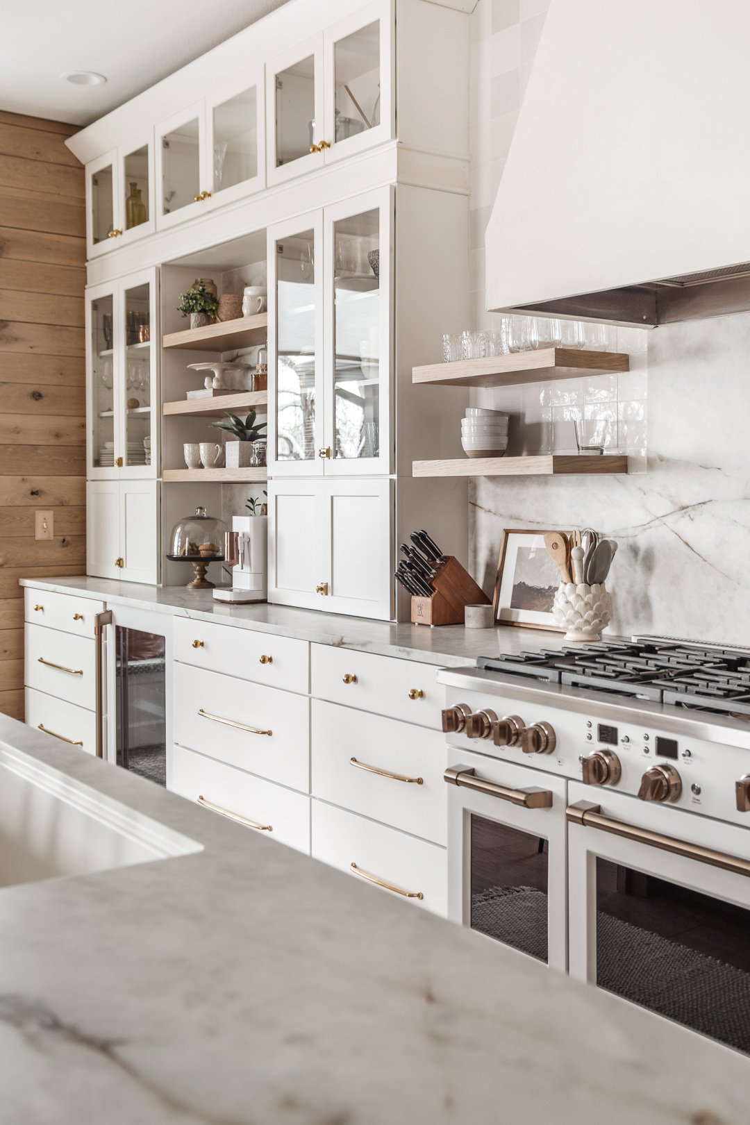
I wanted a smooth, warm, monochromatic look in our kitchen, especially along the back wall where we have around 20’ of creamy white cabinets. As much as I love the bold look of black appliances, for our home, I wanted the kitchen to be soft and warm. By installing white appliances with brushed bronze (essentially a darker form of antique brass) hardware, I ensured a low-contrast look along the back wall, which I think helps it appear even longer since the cabinets aren’t broken up by the appliances.
We installed the following Café Appliances (and we love them!):
One of their most underrated attributes is how easily the matte white and the stainless steel fronts wipe clean—a must-have quality for a family with little ones! The dishwasher is so quiet that we sometimes open it while it’s mid-cycle because we don’t realize it’s on. The espresso machine is my husband’s latest favorite home product, and I think it’ll take a LOT to knock it out of first place for him right now. (He makes a mean spiked latte, too!) The fridge is the perfect size, and it has this amazing autofill feature that blows everyone away when they see it happen for the first time! The drink dispenser basically senses how much available volume is in your cup, water bottle, etc., and you can leave it there, tap “autofill,” walk away, and when you come back, your drink will be filled to the perfect amount! Lots of impressive features with this line, I’ll tell ya!
Modern Komfort Counter Chairs
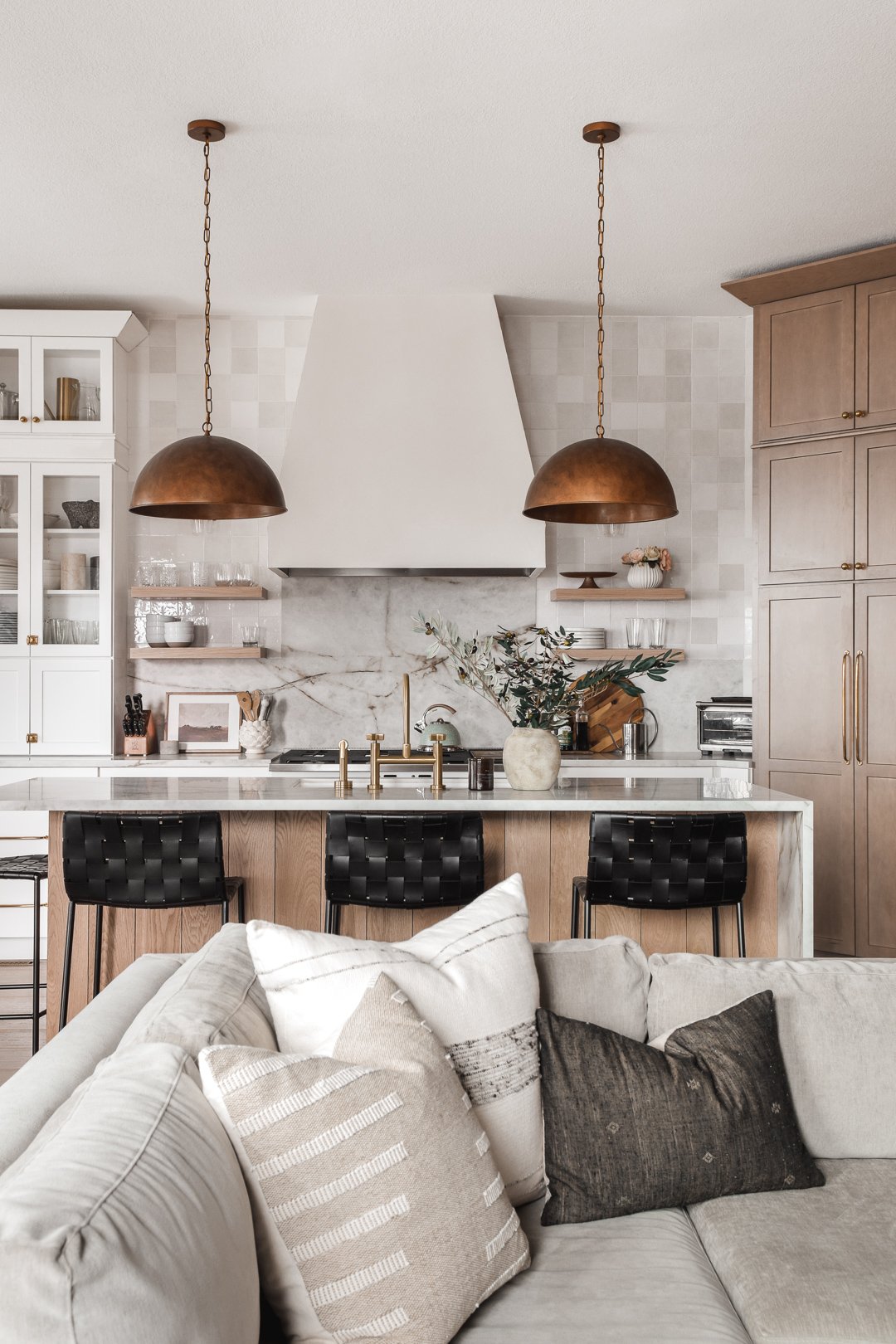
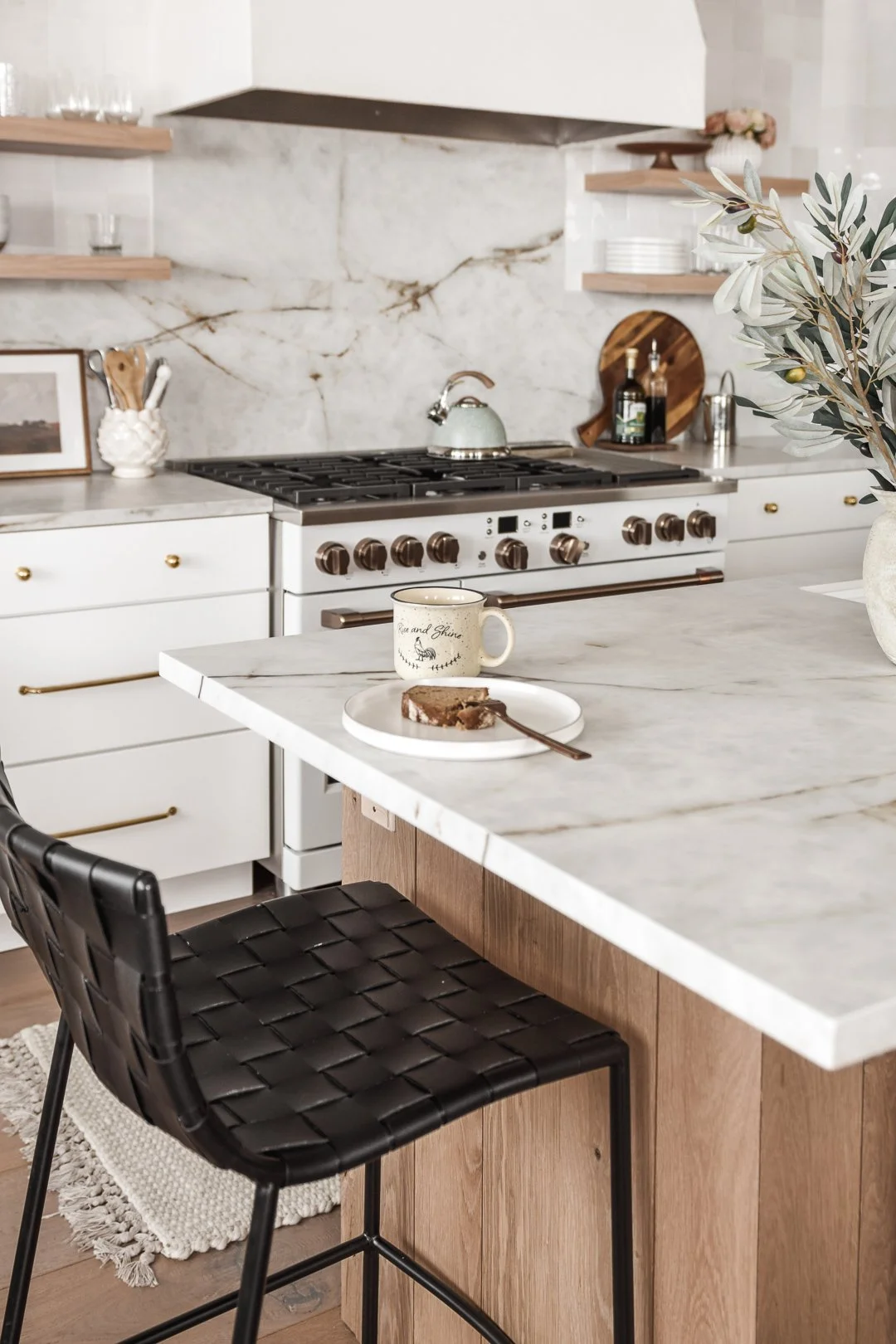
While I didn’t want to break up our back wall of creamy white cabinets with black or stainless steel appliances, that’s not to say I don’t ADORE a cool touch of black in pretty much every space I decorate. When I first spotted these gorgeous black-leather-seat-with-black-metal-legs counter-height stools on Modern Komfort’s website, I knew they’d be the perfect touch of contrast for this remodel. They’re called the Strap Counter Stool, and they’re also available as dining chairs, and as counter stools with a pale brown leather color, called Sand.
Scout & Nimble Lighting
I’ve been a big fan of Scout & Nimble since before I created my own Instagram interior decorating account. Fun fact: They’ve been supportive of me since the very beginning of my journey in this industry, too! They interviewed me back in 2018 as part of their “Designers We Love” blog series. It was actually really great exposure for my brand, helping me secure enough e-design contracts for the upcoming year to justify leaving my career as an English Language Arts teacher behind.
Scout & Nimble carries a timeless, yet very on-trend and vast assortment of home decor and furnishings, so I knew without a doubt that they’d have the perfect soft-lined, warm brass finish light fixtures I was picturing for our new kitchen. We sourced our dining chandelier (the Elk Lighting Wellsley 6-Light Island Light in Burnished Brass) and the two wall sconce lights flanking the range (the Savoy House Octave 1-Light Wall Sconce in Warm Brass) from Scout & Nimble, and I still can’t get over just how beautiful they are in person.
Scout and Nimble also carries a dome pendant by Regina Andrew that’s similar to the pendants I sourced for the island, but in industrial black with gold undersides. I think that had it not been on backorder, I would have definitely ordered these. And then knowing what I know now about how long it would’ve taken for a few of the other key pieces to arrive (renovating during a global pandemic has its limitations), I totally could have had these installed by the time I shared the finished kitchen with you. I do, though, still love these antique gold pendants a TON and cannot get over the warmth they bring to our kitchen.
Rejuvenation Cabinet Hardware + Faucet
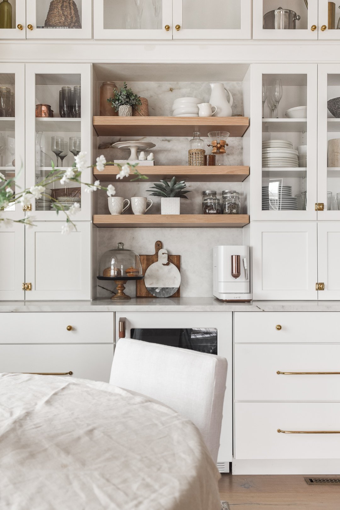
One of my most frequently asked questions is, “WHERE did you get your cabinet hardware?!” Answer: Rejuvenation! I love their beautiful selection of cabinet hardware styles, but even more so, their variety of sizes and finishes within each collection. For all of our cabinetry that closes to the middle, we installed their Small Oval Cupboard Latch pulls. On the top drawers, we installed two Ball Cabinet Knobs, spaced the same distance as the long drawer pulls beneath them. Those extra-long drawer pulls are the Large Massey Drawer Pulls. All of these are unlacquered brass, which ages gracefully with every touch!
Our sink faucet was also from Rejuvenation, and it’s the West Slope Kitchen Faucet with Sprayer. If you’re super picky about matching all your metal tones in a space, then you should know that Rejuvenation’s Aged Brass (which this comes in) is slightly lighter in tone and has a more brushed finish than their unlacquered brass hardware. To me, this didn’t make a difference. It’s a beautiful piece, and I couldn’t not incorporate it in our kitchen’s new design. :)
Ultra Shelf
I stumbled upon Ultra Shelf when I was lost in a Pinterest trance. I must have saved around 20 pins in a row that featured this product, so I reached out to ask for some color samples and explained our project to them. Of course, I also explained that I was a trained interior and product photographer, and that I’d be willing to trade some floating shelves for our kitchen for love on my account. It worked! They were interested in collaborating! Our shelves are the White Oak “Nature” finish (not to be confused with their “Natural” finish), and are 2” thick by 12” deep. If you’re interested in purchasing, you should totally use my 25% off discount code nestoutwest25 at checkout!
I will tell you this again and again (and again!): This product is FANTASTIC! I 100% would recommend, and I want to mount these floating shelves in every space possible! I love the ease of installation, the STURDY wall mounts that the shelves slide right onto, the customization options, and the fact that these are made of REAL wood—not the shiny textured laminate “wood” you might find from other retailers. I did learn one important lesson when I was snapping some styled Christmas product photos featuring dishware and drinkware by another brand: Don’t keep a candle lit underneath your floating wood shelves for too long. Since they are real wood, they also respond to heat as wood does ;)
Serena by Lutron
Our roller shades from Lutron Electronics were the icing on the cake in this space, at least for me. With our 10’ ceilings, those windows in the banquette area let in a lottt of sunlight, and they face directly west, so right around dinnertime, the sun shines directly into our kitchen. These shades have made a world of difference not only with temperature control, but also with the beautiful ambiance they create when the shadows of the trees outside dance on the shades at dusk. They create this too-beautiful-for-words feeling of warmth and inclusion—like your kitchen is giving you the sweetest, most loving hug! You have to be here at sunset to truly understand what I’m trying to say here. Photos, and even video, simply don’t do this feeling justice. If you’re interested in learning more, I invite you to read my full blog post about our Serena Shades by Lutron Electronics.
Bedrosians Zellige Tile
I’ve been waiting for the perfect place to apply my beloved Bedrosians Cloe Tile in our home for YEARS, and I’m so glad this was the space! In my humble opinion, it couldn’t have turned out any better. I went with the Cloe White 5” x 5” zellige tile here for two reasons: 1) I wanted to maintain the monochromatic creamy white long run of cabinetry (and by extension, the wall above them), and 2) with 10’ ceilings, no upper wall cabinets, and an 18” H slab backsplash, we (Jason and I) felt that the wall looked empty and unfinished. It needed some texture, but nothing so busy that it took away from the beautiful slab backsplash below. Bedrosians to the rescue! We used 1/16” spacers, and our grout is Mapei White (which is actually a little warmer than a stark white, so it blends in nicely with the Cloe white tile collection).
Neolith North America + The Stone Collection
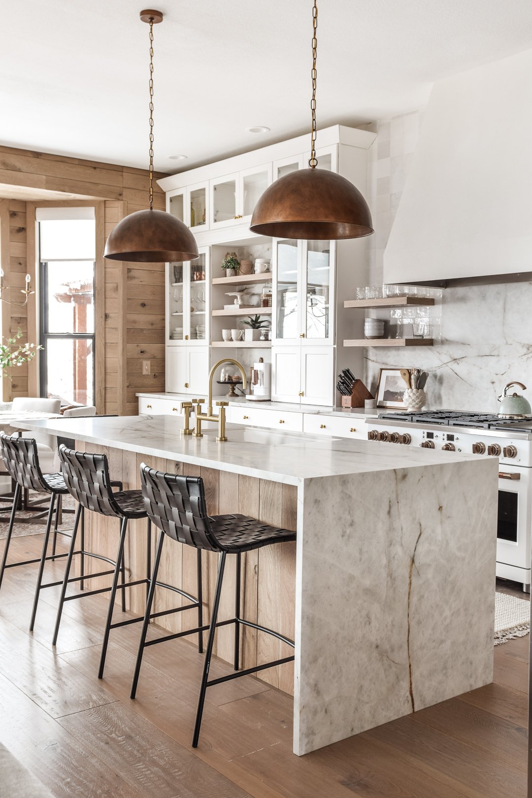
Do I even need to say anything, or can the pictures speak for themselves here???! This stone is called Himalaya Crystal, and it was plucked straight out of my dream-kitchen dreams!! It’s a sintered stone made by Neolith, and it’s sold at The Stone Collection here in Denver. Check your local stone retailer in case they also carry it! What I was most drawn to about this color was the depth of the light gray marbling balanced with the warmth of the rich brown veins running through it.
Being sintered stone, it’s more durable against the elements and anything your kitchen might throw at it than marble, granite, and even quartz! It is even approved for outdoor applications (think: outdoor kitchens, fireplace veneers, even the siding of a building or a super-sleek patio!). Here’s a list of all of the fabulous traits associated with sintered stone, quoted from Neolith.com:
Lightweight and easy to install.
Resistant to scratches and wear.
Resistant to fire and high temperatures.
Waterproof with near zero absorption.
Suitable for direct food contact.
Ridged with high flexural strength
Freeze and thaw resistant.
100% natural.
100% recyclable.
Easy to clean.
UV resistant.
It is a very thin stone, though, so be prepared that your fabrication costs could be a little higher, mainly because they need to create the look of a 1.5” (or thicker) slab of stone by mitering the edges of two pieces and adhering them together—and they do this while also keeping the marbling and veining aligned at the corners. You should see if your stone retailer will provide you a list of sintered-stone-experienced fabricators you can call to price-out your project.
Signature Hardware Register Covers
I realized too far into our kitchen renovation that Signature Hardware also carried kitchen products, and I kicked myself for this so many times! I’ve been referring clients to Signature Hardware for nearly five years now, but mainly for bathroom-related products such as vanities, shower and bath hardware, freestanding bath tubs, etc. In fact, while we were working on our kitchen project ourselves, we were also working on our primary bathroom renovation with local General Contractor Red Beard’s Home Remodeling Services. I’ve been SUCH a fan of Signature Hardware’s bathroom products for so long, yet somehow it didn’t even cross my mind to look to them for kitchen-related products for our remodel! Luckily, I was able to incorporate them in our kitchen in one small, but impactful way: register covers. Who would’ve ever thought that upgrading your register/vent covers would make that much of a difference, but WOW! Going from brown metal grates to these fabulous Honeycomb Brass vent covers instantly increased the glam factor of our home!
Universal Furniture
Our dining table and chairs actually used to live in the formal dining room, which we no longer have because we remodeled that space to become an office (see my post titled "Build a Custom Study from Scratch" for more information on that!). Universal Furniture sponsored them for an advertising campaign I was lucky to have been invited to be a part of about two years ago, but these Carter Side Chairs and the Robards Round Dining Table have stood the test of time, both functionally and stylistically! We started with six of these fabulous side chairs before moving this set over to the banquette area in the kitchen, but unfortunately, one of them fell victim to a red wine incident this past Christmas. We tried everything we could to save it, but the wine was the victor that time.
Non-Sponsored, but Worth Mentioning
People on Instagram are ALWAYS asking me about the wood we used on the banquette walls and on the island. That is wire sawn white oak, untreated, which we sourced from a local (Denver, Colo.) specialty lumber store called Austin Hardwoods of Denver. We also used it to create our fireplace mantel, and I plan on using some of the scrap pieces to fill in and bring some warmth and dimension to a little part of the ceiling outside of the children’s bedrooms where it’s raised up just a little.
Another FAQ is “What are your floors?” They are 10 1/4" x 5/8" European French Oak Blue Ridge Hardwood Flooring from Hurst Hardwoods. Since they’re engineered, they do have a thin layer of real wood atop an engineered, sturdy core. Keep that in mind if you have active pets or small children, as they are more susceptible to scratches.
So now that I’ve walked you through the entire space and all of the products I could think of, please let me know if you have any questions by leaving a comment! I’ll do my very best to reply as quickly as I can :D Thanks so much for being here!
Cait


