The Design Styles I’m Loving for Our New Home
When Jason and I bought our very first home…
…we were total newbies and had no idea how to decorate. In fact, I wish you could have seen our first two apartments that we rented as a married couple: They were a mish-mash of his and my hand-me-down furniture and decor products, plus some IKEA and Target pieces that we bought as college students and new grads living our first-job, starter-salary, go-out-every-weekend, Downtown Chicago lives.
The first home that we purchased together cost far more what we had planned to spend on a starter home. Coming from Illinois, where housing prices had not skyrocketed the way they had here in the Denver area, we didn’t ever think we’d be able to afford a $385K house as 27-year-olds. (For reference, my parents sold their beautiful custom home on 1.25 acres with an in-ground pool and gorgeous landscape design for $400K the year prior, and that was with multiple offers, so it was considered a great selling price!). Unfortunately for us, that’s what the market indicated for a new-construction, builder-basic, tract home in NW Arvada in 2016. At that time, Jason was working as an assistant project manager, and I was teaching seventh grade English. We ate a lot of grilled cheese sandwiches and basic pasta dishes that first year ;) We had both grown tired of our college and post-college mix-n-not-at-all-match furniture, so I started researching things like “How to style a curated home,” “How high to hang art, curtain hardware, light fixtures, etc.,” “How to choose the right paint color based on what kind of natural light a room gets,” “How to properly size rugs,” and more. Yes, I am completely self-taught, but my thirst for decorating tips and answers to design dilemmas led to an obsession. Jason and I decided at that point that we would not just furnish our home; rather, we wanted to make it a canvas to represent our style. We just didn’t have any money, so that was when we learned to be frugal by DIYing our way to a home we were proud of.
At the time, Modern Farmhouse was the craze, and I didn’t know many other design styles because I was just getting started. We designed our quaint and cozy 1800 sq ft home with white shiplap, cedar accents, high-contrast black and vibrant green statement walls, cable railings, and cutesy farmhouse decor pieces (yes, including signs and pillows with words on them). I sourced a lot of materials from Habitat for Humanity Re-Store, and I even grabbed some (still functioning!) task lamps from the donate bin at work and painted them gold.
Our first home: 1800 square feet of builder-basic new construction that we customized ourselves while learning all about DIY, design, all of the different interior design styles out there, and figuring out what *our* tastes really were.
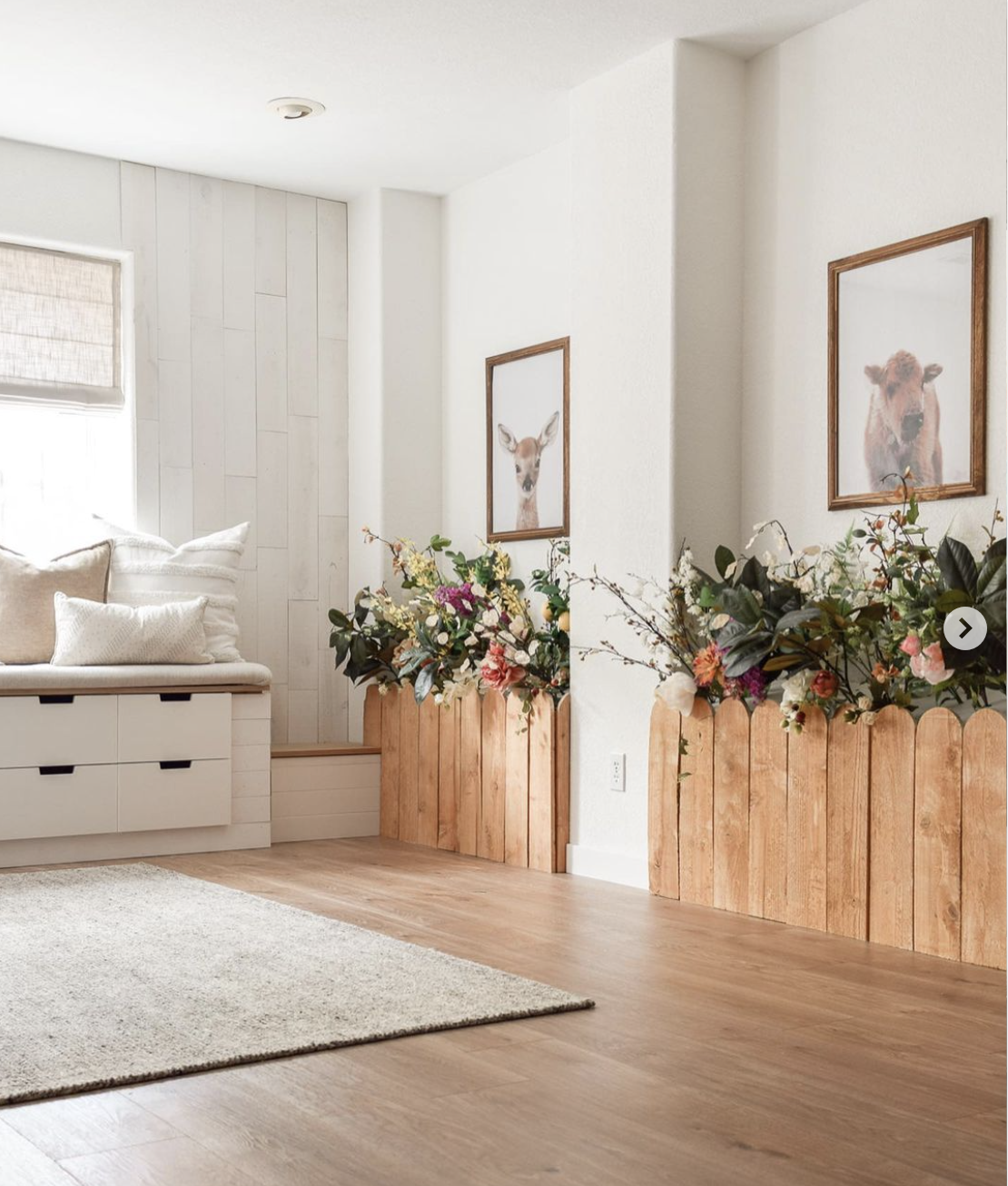
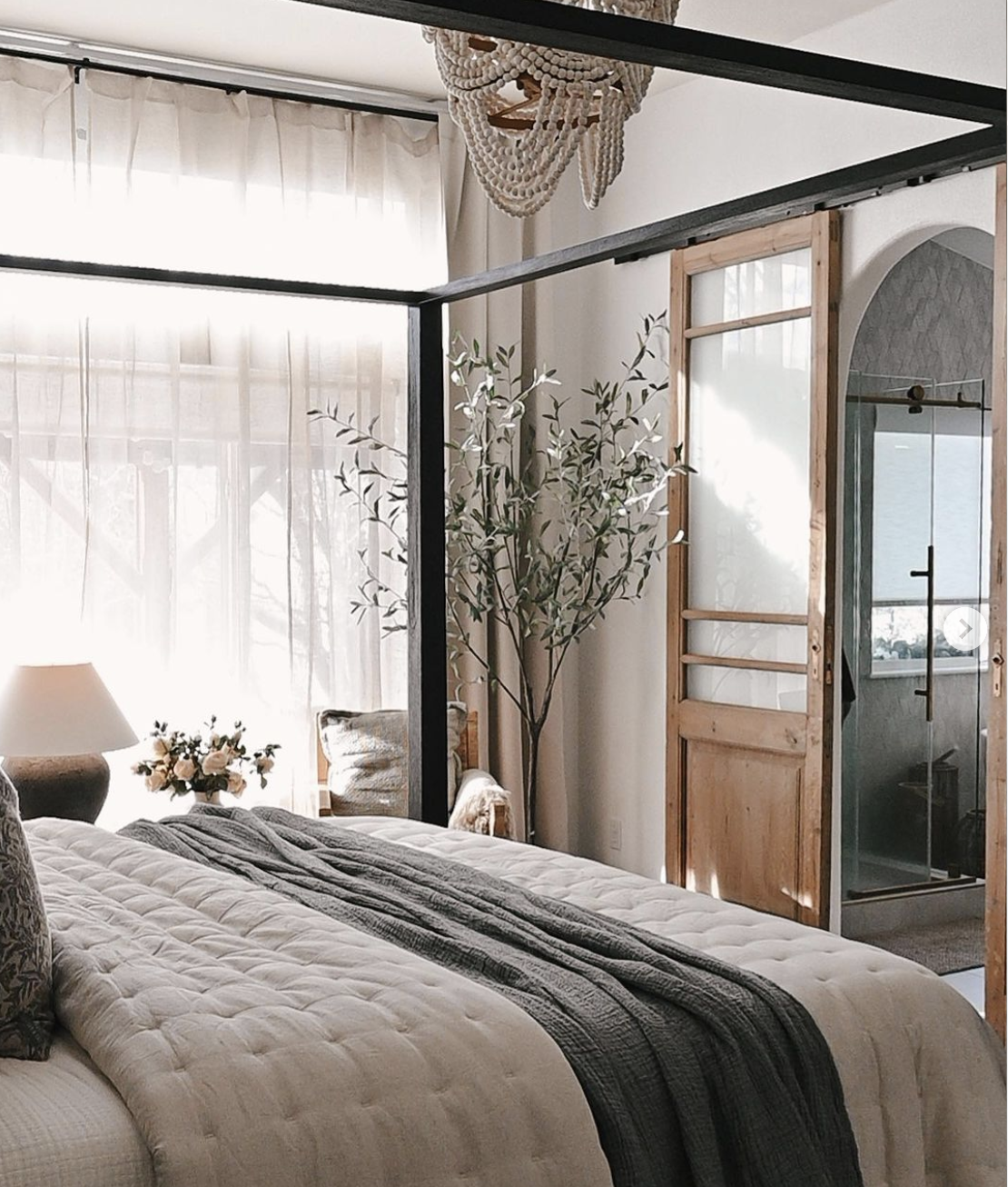
By the time we moved into our next home, our knowledge of other design styles had expanded a little bit to include more earthy and organic elements; more rustic textures; and we incorporated more traditional/less modern-farmhouse trim styles, décor, and finishes. We maintained a modern farmhouse style palette of white walls, wood base finishes, and charcoal accents, but softened the contrast a bit to lend a more organic-rustic style.
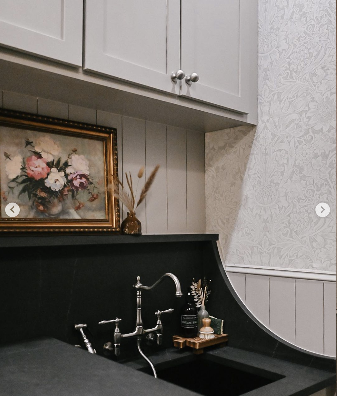
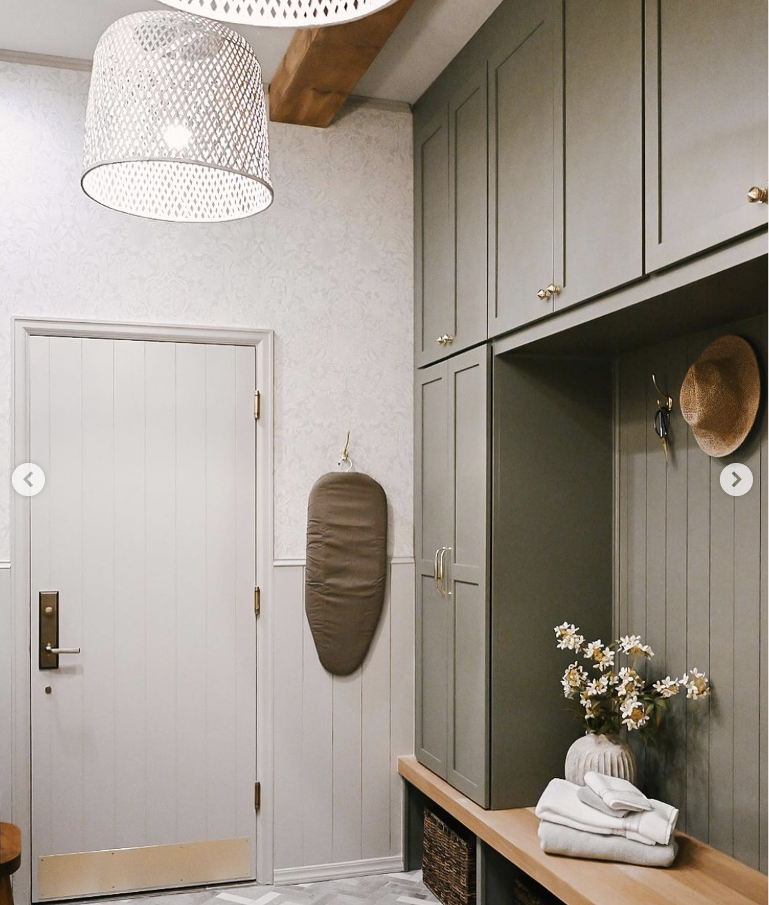
Toward the end of our time in this house, I also grew fond of the cottagey vibes seen in more pattern-filled, color-saturated rooms with moodier finishes and collected pieces, so I incorporated that into our last two projects in this home: the expanded laundry/mudroom and the spare bathroom. Despite wanting to create our own vibe that mixed a handful of design styles, our home was featured as a full spread in the Early Spring 2024 issue of Modern Farmhouse Style Magazine, by Better Homes and Gardens (grab a copy here if you’d like!). Of course, I’m beyond grateful for the opportunity to share our work in a national publication, but want my clients to know that I’m more than a modern-farmhouse-style decorator and designer.
In Our Next Home…
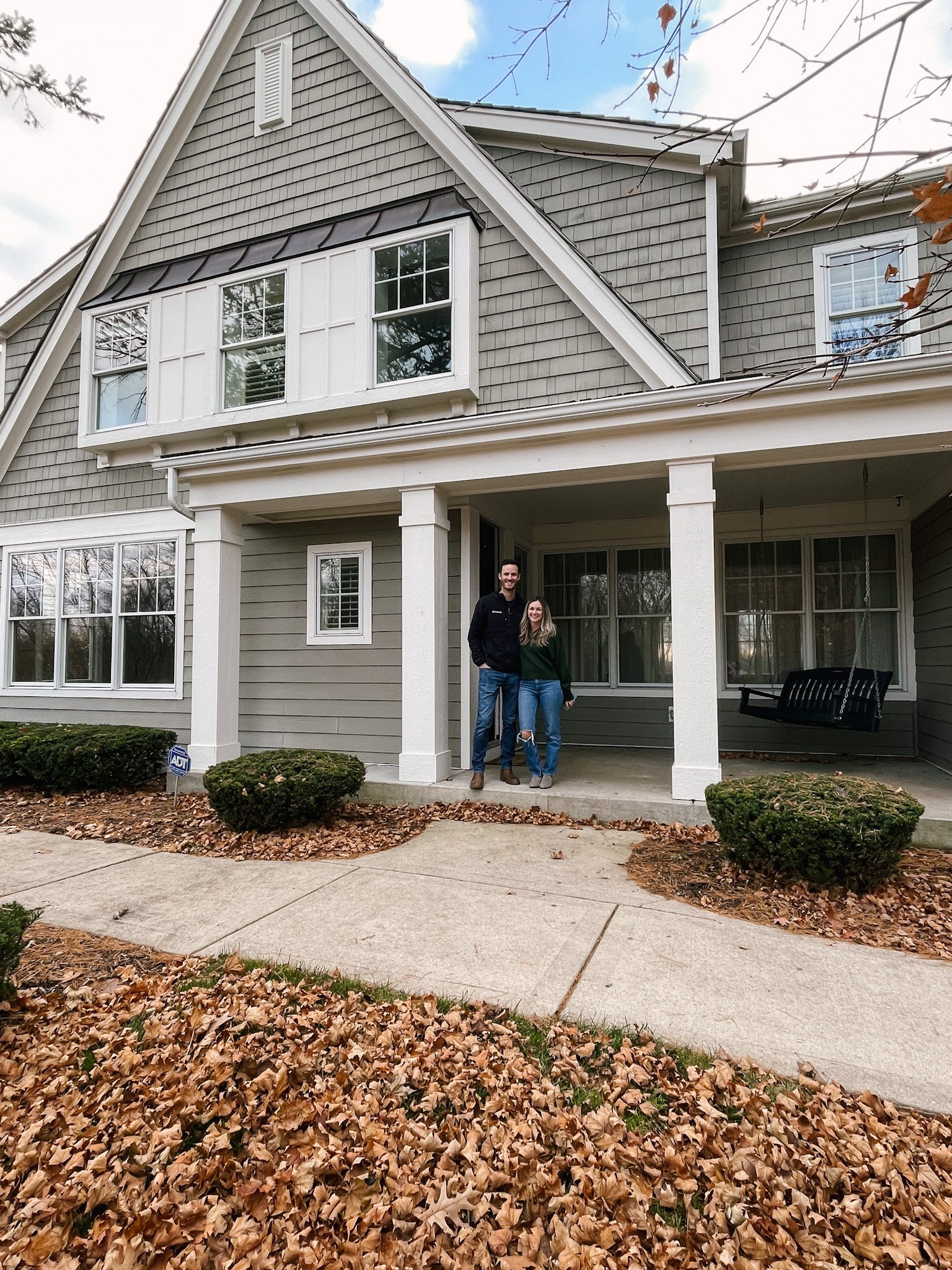
I’ve already begun putting some mood boards and concepts together to show Jason the vibe I want to go for in our next home. He’s on board :) I was originally puzzled by what to call the exterior architecture of the home. Upon first glance, it felt very coastal-classical to me, but I didn’t want to proceed with a coastal décor style because you can’t see (or walk to for that matter) water from this property. It’s surrounded by forest and cornfields! After asking my uncle, who has a master’s degree in architectural design, and consulting images of similar looking homes on the internet, I can say with confidence that the style of our new home is a cross between “New England Shingle Style” (a more rustic take on Colonial style, and with less of an emphasis on symmetry) and “Coastal Cottage.” I also found a few homes that look similar to this and have been described as “Arts and Crafts Style,” which I would love to incorporate in the interior remodeling we’re planning to do, but I don’t feel this style completely encompasses this home. My goal is to honor parts of each of these styles as we renovate the interior finishes, while also incorporating our own fresh spin so that it feels like our home and not a copy-paste of homes with similar aesthetics that I’ve seen on Instagram and Pinterest.
New England Shingle Style
Bear with me here, as I’m still educating myself on all of these architectural descriptions—I’d welcome your input if you know more about the architectural style of our new home! I went down a rabbit hole of New England Colonial and East-Coast Craftsman sub-styles, and I found some descriptions and images of New England Shingle Style that align well with how I’d describe our new home. Aside from the obvious characteristic being shake/shingled siding and roofing, here’s a little bit about Shingle Style homes: This style can be identified by its front-facing pitched gables, many have shed rooflines in places, and there’s a digression from the centered symmetry commonly seen in Colonial Style architecture. It was most popular in the late 1800s into the early 1900s in Northeastern coastal properties. It was meant to counter the “fussiness” of the ornate, decorative, and elaborate Victorian style for people who weren’t big into all the frou-frou.
With that being said, Shingle Style homes—despite being intentionally made to look rustic, weathered, and relaxed—were deceptively spacious on the inside and were popular among wealthy buyers at that time (think Hamptons homeowners). As they became more and more popular, home builders and architects found ways to design Shingle Style homes on a smaller scale, with smart approaches toward materials to help save on building costs, and a less in-your-face-coastal aesthetic for fashionable neighborhoods farther inland. Being a literature geek (I used to teach English), the vibe of “Shingle Style” reminds me of the Romantic Naturalist authors such as Emerson, Thoreau, Whitman, and Hawthorne, who valued the simplicity of natural materials, connection to earth (I’m picturing muted blue, green, and brown tones), and a utilitarian approach to life and work. BUT, I would also imagine them appreciating the finer things from time to time. I’m thinking there will definitely be some “Country Club Grandpa” vibes happening in at least one or two rooms in this house!
Frank Lloyd Wright’s historic Oak Park home is considered Shingle Style
Classic Coastal Cottage Style
The use of shingles in exterior design dips into a handful of other design styles, but I would argue that one could almost always expect to see them on Classic Coastal Cottage home exteriors. Growing up in a town surrounded by lakes and spending weekends 30 minutes north on the beautiful Lake Geneva in Wisconsin (known for its stunning, high-end, lakeside homes), I’ve seen countless lake houses that are clad in shingles and shake. Stained, painted, weathered, it doesn’t matter—they’re all beautiful and all fundamentally “coastal.” That’s why our new home initially struck me as coastal.
Classic Coastal architecture is also known for having a combination of steep pitched gables and shed roofs, as well as plenty of windows to brighten the interior with natural light from every direction (and of course, to take in the water views!). We don’t have water views at our new home, but there are large windows in every direction. There’s a pretty cedar shake roof, and we have painted shingle siding nearly all around! I love this view of the back of the home, which captures the shingle siding and the abundance of windows.
Arts and Crafts Style
Like I mentioned earlier in this post, this home isn’t really classified as an Arts and Crafts Architectural Style. That doesn’t mean that it never can be, though. ;) You see, Arts and Crafts isn’t as much a definitive style as it is an approach. The Arts and Crafts movement is more commonly associated with Craftsman and Bungalow home styles, but similar to the New England Shingle Style, it began in the late 1800s (the 1880s to be exact), founded by William Morris as a rebuttal to the excessiveness seen in Victorian design. In addition, it was Morris’ and his followers’ solution to a world that felt more and more hardened, cold, and cookie-cutter thanks to over-industrialization during and after the Industrial Age.
The Arts and Crafts movement sought to bring natural materials back into the home as opposed to man-made, mass produced materials. It celebrated handicrafts and skilled carpenters, and there still today is an emphasis on repurposing old materials in new ways, lending a collected and curated feel to Arts and Crafts interiors.
How All of This Applies to Our New Home
After doing a deep dive into the architectural styles that seem to describe this new home of ours, I am not only feeling guided, but also totally INSPIRED to refinish some of the interior elements and decorate the whole interior of the home so that it aligns with these styles and their overarching qualities. Without further ado (thanks for sticking with me this long!), here are some of the ways I’m planning to customize this home while we live in it:
Wood Tones
We’ve already been collecting flooring and cabinet samples to hone in on the right wood stains and finishes. Not wanting to have the whole home be too matchy-matchy, Jason and I are planning to pull in two types of flooring, both with deeper, richer, and a tad smokier wood stains than what we used in our Colorado home. The flooring materials we’re most strongly considering are the following two from LL Flooring—only around $8 per square foot!
In the open-concept spaces such as the great room, kitchen, eat-in dining, and foyer, and for the entire upstairs (bedrooms and hallways), we’re looking at Bellawood Artisan Monaco White Oak wide plank engineered hardwood flooring.
For the enclosed rooms on the main floor, which include the formal dining, the den that we’re calling our music room, and the office, we’re loving the Virginia Mill Works Boulder Herringbone engineered hardwoods.
What I love about these two products is that they both provide subtle tone variation from plank to plank, and they will coordinate so nicely from the larger, more open spaces into the enclosed rooms, of course using flooring transitions. I think the darker brown stain and the smoky, matte finish will set the tone for the arts and crafts, New England shingle-style vibe, while playing nicely with muted cooler tones that bring in an earthiness and pull a touch of coastal/lake house style in.
Kitchen Ideas
I wish I could find an example on Pinterest of exactly what I’d like to do in the kitchen, but then again, I’m grateful that I can’t find my exact vision for this space online. I pulled together an overall vibe, which shows darker, richer wood stains paired with creamy painted cabinetry, and while I’m a fan of certain elements of each of these images, I would love make this our own by incorporating rustic and organic touches that align with our “signature” style and pay homage to the Arts and Crafts movement and the Shingle Style design. I also plan to put more attention into the little touches like “feet” on the base cabinets, layered crown moulding, and a more detailed edging along the countertops.
Eat-In Dining Nook
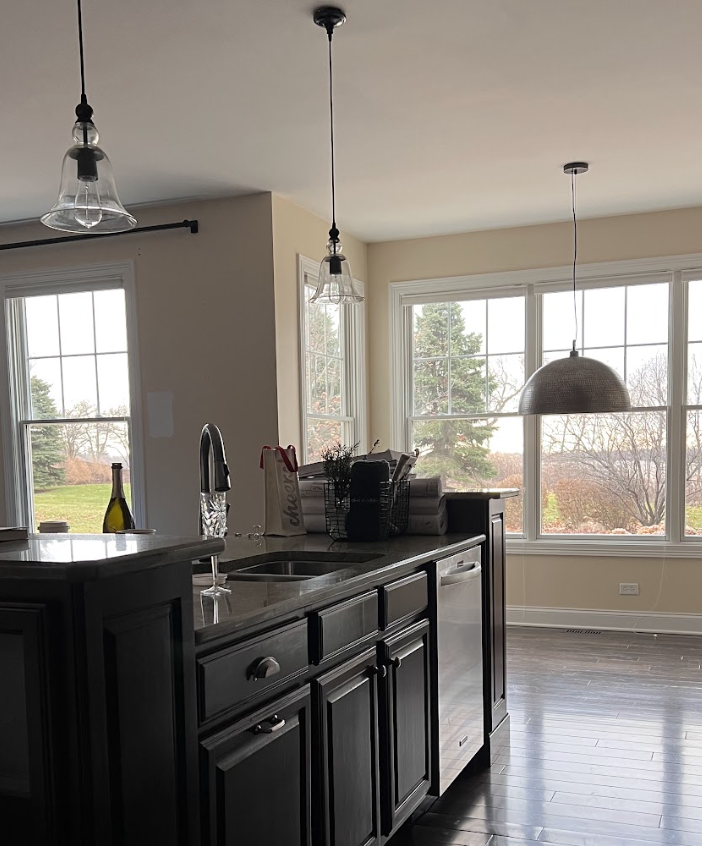
Our kitchen has this 60” x 131” bump-out, with beautiful tall windows lining the entire nook. My cabinet designer and I thought for a brief moment that this would be a great use of space for more base cabinetry, looking out into the back yard and serving as a prep zone or coffee counter. But then I pulled up the photos I snapped during our closing, and I saw that the windows actually come down pretty low on the wall, so it would be a shame to block all that beautiful natural light with more cabinetry.
I’ve decided I’d like to add some detailed moulding and trim-work to those three walls that will surround the eat-in dining table and chairs, and I think it would be pretty to paint everything (walls, crown, window trim, and base) all the same shade. I’m picturing a warm, neutral, earthy tone, not too contrasty from the rest of the space; rather, a tone that would naturally flow with the creamy cabinet color and the smoky wood floors. I’m also not loving the cellular up-down shades on these windows, and since we don’t have any back-door neighbors, I’m thinking some linen cafe curtains here would be pretty. Finally, I need to go stand in the space again to get a feel for whether or not a ceiling treatment such as a wire sawn white oak would make sense here, but I think it would provide such beautiful texture and would give this part of the home a little more of an identity. Here’s a quick concept I created (note that this floor isn’t the exact color I’ve selected; it’s just there for the concept):
Products seen here are linked through the ShopLTK app in my @nest.out.west feed.
Family Room
With the kitchen, eat-in dining, and family room all belonging to one larger overall space, I want to make sure that the furniture and décor I select are pieces that work together without looking like they all came in a set. To do this, I’m selecting products with wood tones that are found in the variations seen in the flooring, and that are different from (while being complementary to) the wood tones in the kitchen cabinets and seating. This has always been one of my styling tricks I share with clients who are lost on how to mix and match wood tones. Pulling from the tones in your floor is always the easiest place to start!
Also, Jason and I are in agreement that the craftsman style carpentry surrounding the wood-burning fireplace needs to be replaced in order to maintain consistency with the interior design style. I’m hoping we can remove it cleanly and donate the whole surround to Habitat Re-store so somebody else can use it! We are planning to have an over-mortared natural limestone veneer installed here from the ground, up, and I’d also like to order a cast-stone mantel and surround to frame the firebox opening. We’ll paint the built-ins, and I plan to remove the broken glass cabinet doors at the top and create a colonial-style, elongated arch at the top, keeping open shelving in that area. On the other side of the fireplace, our plan is to match that same style of arch and change the hall opening to that.
The furniture I’m planning to order pulls in a combination of warm tones, as well as some more durable upholsteries, such as performance velvet and Crypton. Of course, it’s not truly my style without some black accent pieces sprinkled into the room. I currently have the table lamp seen below in our bedroom, but I would happily bring it into the new family room once we move. The texture on it is artisanal and organic feeling, and it’s a very weighty, quality piece!
Products seen here are linked through the ShopLTK app in my @nest.out.west feed—the chandelier was left by the previous owners, and it’s a Pottery Barn alabaster-shade chandelier that has been discontinued.
What’s Next?
Currently, this is as far as we’ve gotten! I’d love to get to work on more spaces in this home (mudroom, pantry, music room, formal dining, office, bedrooms, and bathrooms are all still to-come!), but we need to 1) save-up before we can make plans to renovate further, and 2) I want to live in the home and get a feel for how the next spaces should function based on how we’re using them and enjoying them as a family.
Follow along on Instagram @nest.out.west for real-time decisions, progress updates, and behind the scenes glimpses into our life as our family settles into this next chapter!


